
International Arctic Buoy Program
Revamping the data searching and downloading experiences, addressing the current lack of user-friendly features and intuitive processes for the International Arctic Buoy program to ensure a clear and consistent navigation structure, ultimately facilitating seamless access to crucial buoy data for arctic researchers and stakeholders to support research initiatives on Arctic climate, climate change, and weather forecasting.
What I did?
Qualitative Research, Workflows, Card Sorting, Paper prototyping, Rapid prototyping, Usability testing, Design Systems, Hi fi prototypes
Role
UX UI Designer, UX Researcher
Duration
3 months
Tools
Figma, Whimsical, Optimal Workshop,
Team
3 Designers
1 Researcher
1 Developer
Background
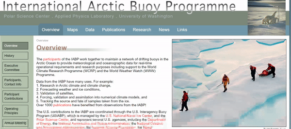
The IABP is a collaborative effort that maintains a network of drifting buoys in the Arctic Ocean.
-
Primary Goal : Provide crucial meteorological and oceanographic data to support research initiatives.
-
Applications : Research on Arctic climate, weather forecasting, satellite validation, climate modeling, and sample tracking.
-
Impact : IABP observations influenced 1000+ publications, demonstrating their data's substantial impact & usefulness.
Challenges


Large amount of data in a tabular format challenged users to view and process information.
Broken navigation is another problem, which drove visitors away in frustration.
Out-of-date content frustrated users looking for recent and pertinent information.
Business Objectives
We identified the business objective after talking to the stakeholders.
Making data accessible and easy to download for new users and returning users.
Increasing awareness & exposure for organization to sustain & advance their work.
Enhancing IABP’s visibility among potential investors and their collaborators.
Design Objectives
After that we drafter our design objectives and tenets that lead us in the design process.
Make tasks easier for IABP users to effortlessly find and download relevant information on the website.
Streamline the process of updating and maintaining content for the IABP team.
Minimize visual distractions, for efficient analysis and interpretation of data.
Strive for a harmonious blend of simplicity and balance in terms of both aesthetics and functionality, while ensuring optimal website performance.
Design

How we got there?
Key Research Questions
-
What is the intent of the website?
-
Who are the primary users and what are the key tasks the users perform while using the website?
-
What is important to the users when searching for data and downloading data?
User Research
Internal Interviews
Understand stakeholders goals and perspective
Analyzing usability report
Evaluate usability for users to navigate and interact with the website
External Interviews
Understand how users use the website
Cognitive Walkthrough
Observe typical use cases and navigation of the website.
User Research Findings
-
Users want easier and quicker dataset navigating process
-
User wants simpler dataset downloading process & various file type choices
-
Not to have multiple broken links on the website
-
The users want the website to be more user friendly
-
The user wants the buoy maps to be easy to navigate and interact
Personas
Through user research we categorized our users into primary and secondary personas, our primary persona


Information Architecture
We conducted card sorting on optimal workshop with 9 participants to better organize the content on IABP website.
We simplified the navigation with clear and fewer categories to allow users to reach the data quickly.
Old
New


Ideation

Lo fi Designs
We implemented the data that we gathered from our user research to make Lo-fi protoypes which we then testes with 5 general participants to get valuable feedback.

Iteration 1
Added the card view for the general public to navigate the data easily.

Iteration 2
In our high-fidelity usability testing, oceanographers and scientists emphasized their preference for viewing data in table form over the grid view, citing their training and familiarity with this format. This feedback confirmed the need to prioritize the table view in our interface design.
Consequently, we chose to retain both data views, refining them iteratively to enhance usability and clarity. By incorporating this feedback-driven refinement process, we aimed to cater to the specialized needs of oceanographers while also ensuring an intuitive experience for the general public.

Table format favoured by researchers because of familarity of use

Card format for general public to read data more effectively


Impact
Ahh!! This going to save me so much time!!
This is so exciting!!! when I can actually use the new version of IABP website? ”
Reduced time to complete task
The redesigned website significantly improved data set retrieval time, boasting a remarkable 74% reduction compared to the original design.
Overall User Satisfaction Rate
The final high-fidelity prototype achieved an impressive satisfaction rate of 95% among users during user testing.
Reduced number of errors of task completion
Streamlined Information Architecture and intuitive UI design on internal pages contributed to a notable reduction in complexity and a 66% decrease in error taps for each task.
Reflection and learnings
Importance of Contextual Learning
Given the niche nature of the field, we dedicated ample time to comprehensively understand both the content and the contextual usage of the website. This deep dive enabled us to tailor a user experience finely attuned to the unique needs of our distinct user group, resulting in a more refined and effective design solution.
Balancing functionality and aesthetics
Maintaining a delicate balance of visual appeal and user friendliness while maintaining the scientific essence and accuracy of the application is of utmost importance. Striking this balance provides functionality remains complex, while simplicity makes for better usability, and culminates in communication that seamlessly blends scientific rigor with user-centered design principles
Scoped target user groups
A thorough understanding of unique user categories enabled us to craft tailored solutions, culminating in a website redesign that is both impactful and user-centric.
Future Considerations
-
Ensuring the product has an easy on/off feature
-
Considering scenarios where multiple sounds may occur simultaneously
-
Addressing the issue of filtering out strong background noise
-
Including suggested actions, such as a call-to-action button to call 911 in case of an emergency.